Plotting infrared spectra and hyperspectra can be fun, but frustrating! This tutorial is a starting place to make the your plots and figures look the way you want without leaving Quasar/Orange.
There are many resources that go further than this tutorial. Check out: https://matplotlib.org/ and https://seaborn.pydata.org/
Matplotlib tutorial
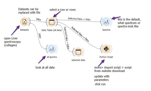
In Quasar, you can use the "python script" widget to format plots using matplotlib.
This workflow shows the process starting with data from quasar datasets. The same sequence could be used by selecting spectra from any data table, spectra plots or hyperspectra. Attach the python script widget to the output of your selected data, and format your plots from the script window.
Basic Scripts
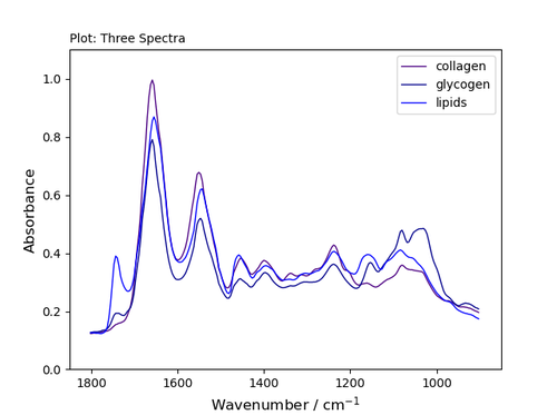
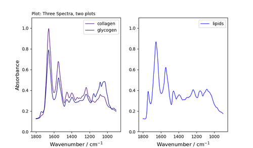
Below are a series of figures, click on the link to get the .py file to generate the plot in quasar.
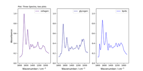
One plot, three curves, legend; .py file
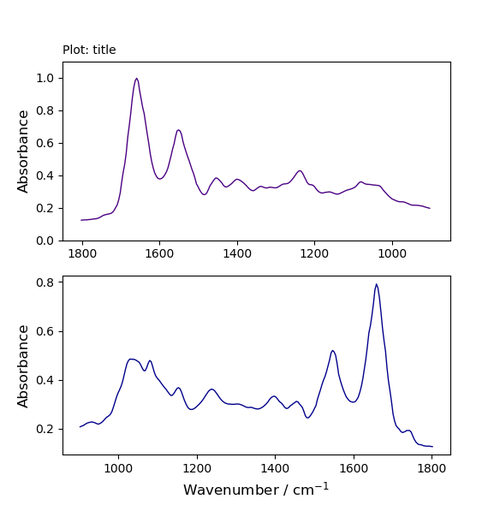
Two plots, three curves; .py file
fig, (ax, ax2) = plt.subplots(1,2) OR fig, (ax, ax2) = plt.subplots(2,1)
Three plots, three curves; .py file
Arrows and Text
Add arrow; .py file
To add an arrow, format your plot as above and then add the line:
ax.annotate('key peak', xy=(1600,0.8), xytext=(1400,0.7), arrowprops=dict(facecolor='black', width=0.4, headwidth=6, shrink=0.05),)
Format the annotation
- you can add text;
xyindicate the location of the arrow tip - using the plot's co-ordinates;xytextindicated the location of the text;- choose the properties of the arrow (
facecolour;width=line thickness;headwidth= size of head;shrinkmove the tip and base some percent away from the annotated point and text
More arrow examples can be found at https://matplotlib.org/tutorials/text/annotations.html
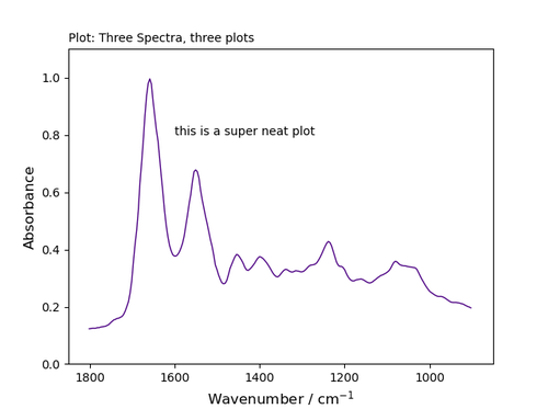
Add Text
To add text to any location on your plot, include the line
ax.text(1600,0.8, r'this is a super neat plot')
Add text using the xy coordinates of the plot
The r preceding the text string is important -- it signifies that the string is a raw string and not to treat backslashes as python escapes.
x-coord = 1600
y-coord = 0.8
text string = r'the text you want on the graph'
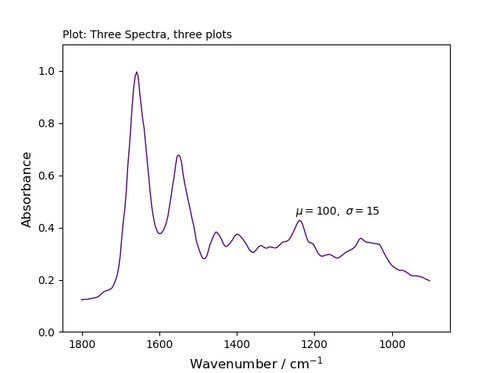
Use latex to format your text and incorporate the output directly into your figure
ax.text(1250, .45, r'$\mu=100,\ \sigma=15$')
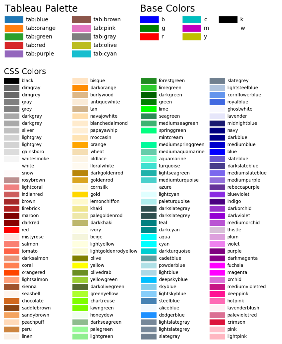
Colours
Lines and Markers
| Character | Line description | ||
|---|---|---|---|
| '-' | solid line style | ||
| '--' | dashed line style | ||
| '-.' | dash-dot line style | ||
| ':' | dotted line style |
| Character | description | ||
|---|---|---|---|
| '.' | point marker | ||
| ',' | pixel marker | ||
| 'o' | circle marker | ||
| 'v' | triangle_down marker | ||
| '^' | triangle_up marker | ||
| '<' | triangle_left marker | ||
| '>' | triangle_right marker | ||
| '1' | tri_down marker | ||
| '2' | tri_up marker | ||
| '3' | tri_left marker | ||
| '4' | tri_right marker | ||
| 's' | square marker | ||
| 'p' | pentagon marker | ||
| '*' | star marker | ||
| 'h' | hexagon1 marker | ||
| 'H' | hexagon2 marker | ||
| '+' | plus marker | ||
| 'x' | x marker | ||
| 'D' | diamond marker | ||
| 'd' | thin_diamond marker | ||
| '|' | vline marker | ||
| '_' | hline marker |
More Options
Want more control?
Layouts
Adjust the layout of your figure using plt.tight_layout()
https://matplotlib.org/tutorials/intermediate/tight_layout_guide.html
Major and minor ticks
https://matplotlib.org/gallery/ticks_and_spines/major_minor_demo.html