Plotting infrared spectra and hyperspectra can be fun, but frustrating! This tutorial is a starting place to make the your plots and figures look the way you want without leaving Quasar/Orange.
In Quasar, you can use the "python script" widget to format plots using matplotlib.
Python Script Widget
This workflow shows the process starting with data from quasar datasets. The same sequence could be used by selecting spectra from any data table, spectra plots or hyperspectra. Attach the python script widget to the output of your selected data, and format your plots from the script window.
Below are a series of figures, click on the expand and copy the text into the Python Script widget to generate the plot in Quasar.
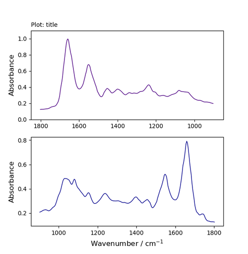
Python Script: One Curve, One Plot
Python Script: One Curve, One Plot
import matplotlib.pyplot as plt

import numpy as np

from Orange.data import Table

from orangecontrib.spectroscopy.data import getx

spectra = in_data.X

energy = getx(in_data) #This is specific to getting data from Orange data files

###############################################################

fig, ax = plt.subplots()

###############################################################

ax.plot(energy, spectra[0], 'indigo', linewidth=1.0, label='label indigo line text')

#add label='label text' if you want to add a legend

#choose colour

#choose line width

###############################################################

#add title

title = ax.set_title('Awesome test plot',fontsize='10', loc='left') # location = centre, left, right (default is centre)

###############################################################

#add axis labels

ax.set_xlabel('Wavenumber / cm$^{-1}$', fontsize='12')

ax.set_ylabel('Absorbance', fontsize='12')

###############################################################

#set axis limits -->can use to reverse axis for IR spectra

ax.set(xlim=(1850, 850)) #this is the wavenumber region you want to show

ax.set(ylim=(0,1)) #this is the absorbance range

###############################################################

#add legend

ax.legend() #if you added label text use this to make a legend

###############################################################

plt.show()
import matplotlib.pyplot as plt

import numpy as np

from Orange.data import Table

from orangecontrib.spectroscopy.data import getx

spectra = in_data.X

energy = getx(in_data) #This is specfic to getting data from Orange data files

fig, ax = plt.subplots()

################################################################################

ax.plot(energy, spectra[0], 'indigo', linewidth=1.0, label='collagen') #add label='label text' if you want to add a legend

ax.plot(energy, spectra[1], 'darkblue', linewidth=1.0, label='glycogen') #add label='label text' if you want to add a legend

ax.plot(energy, spectra[2], 'blue', linewidth=1.0, label='lipids') #add label='label text' if you want to add a legend

################################################################################

#add title

title = ax.set_title('Plot: Three Spectra',fontsize='10', loc='left') # location = centre, left, right (default is centre)

################################################################################

#add axis labels

ax.set_xlabel('Wavenumber / cm$^{-1}$', fontsize='12')

ax.set_ylabel('Absorbance', fontsize='12')

################################################################################

#set axis limits -->can use to reverse axis for IR spectra

ax.set(xlim=(1850, 850)) #this is the wavenumber region you want to show

ax.set(ylim=(0,1.1)) #this is the absorbance range

################################################################################

ax.legend() #if you added label text you need this to make a legend

################################################################################

plt.show() #show plot
import matplotlib.pyplot as plt
import numpy as np
from Orange.data import Table
from orangecontrib.spectroscopy.data import getx
spectra = in_data.X
energy = getx(in_data) #This is specfic to getting data from Orange data files
################################################################################
fig, (ax, ax2) = plt.subplots(1,2)
################################################################################
ax.plot(energy, spectra[0], 'indigo', linewidth=1.0, label='collagen') #add label='label text' if you want to add a legend
ax.plot(energy, spectra[1], 'darkblue', linewidth=1.0, label='glycogen') #add label='label text' if you want to add a legend
ax2.plot(energy, spectra[2], 'blue', linewidth=1.0, label='lipids') #add label='label text' if you want to add a legend
################################################################################
#add title
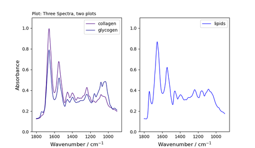
title = ax.set_title('Plot: Three Spectra, two plots',fontsize='10', loc='left') # location = centre, left, right (default is centre)
################################################################################
#add axis labels for left plot
ax.set_xlabel('Wavenumber / cm$^{-1}$', fontsize='12')
ax.set_ylabel('Absorbance', fontsize='12')
################################################################################
#add axis labels for right plot
ax2.set_xlabel('Wavenumber / cm$^{-1}$', fontsize='12')
#ax2.set_ylabel('Absorbance', fontsize='12')
################################################################################
#set axis limits -->can use to reverse axis for IR spectra
ax.set(xlim=(1850, 850)) #this is the wavenumber region you want to show
ax.set(ylim=(0,1.1)) #this is the absorbance range
################################################################################
#set axis limits for right plot
ax2.set(xlim=(1850, 850)) #this is the wavenumber region you want to show
ax2.set(ylim=(0,1.1)) #this is the absorbance range
################################################################################
ax.legend() #if you added label text you need this to make a legend
ax2.legend()
################################################################################
plt.show()
import matplotlib.pyplot as plt
import numpy as np
from Orange.data import Table
from orangecontrib.spectroscopy.data import getx
spectra = in_data.X
energy = getx(in_data) #This is specfic to getting data from Orange data files
fig, (ax, ax2,ax3) = plt.subplots(1,3)
##################################################################################################
ax.plot(energy, spectra[0], 'indigo', linewidth=1.0, label='collagen') #add label='label text' if you want to add a legend
ax2.plot(energy, spectra[1], 'darkblue', linewidth=1.0, label='glycogen') #add label='label text' if you want to add a legend
ax3.plot(energy, spectra[2], 'blue', linewidth=1.0, label='lipids') #add label='label text' if you want to add a legend
##################################################################################################
#add title
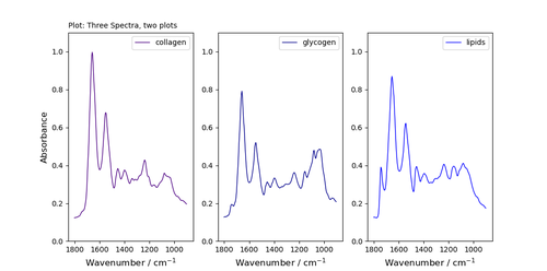
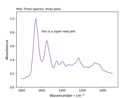
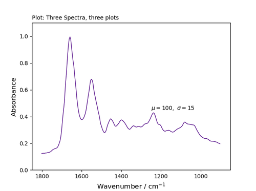
title = ax.set_title('Plot: Three Spectra, three plots',fontsize='10', loc='left') # location = centre, left, right (default is centre)
##################################################################################################
#add axis labels for left plot
ax.set_xlabel('Wavenumber / cm$^{-1}$', fontsize='12')
ax.set_ylabel('Absorbance', fontsize='12')
#add axis labels for right plot
ax2.set_xlabel('Wavenumber / cm$^{-1}$', fontsize='12')
ax3.set_xlabel('Wavenumber / cm$^{-1}$', fontsize='12')
#ax2.set_ylabel('Absorbance', fontsize='12')
#################################################################################################
#set axis limits -->can use to reverse axis for IR spectra
ax.set(xlim=(1850, 850)) #this is the wavenumber region you want to show
ax.set(ylim=(0,1.1)) #this is the absorbance range
#set axis limits for other plots
ax2.set(xlim=(1850, 850)) #this is the wavenumber region you want to show
ax2.set(ylim=(0,1.1)) #this is the absorbance range
ax3.set(xlim=(1850, 850)) #this is the wavenumber region you want to show
ax3.set(ylim=(0,1.1)) #this is the absorbance range
##################################################################################################
ax.legend() #if you added label text you need this to make a legend
ax2.legend()
ax3.legend()
##################################################################################################
import matplotlib.pyplot as plt
import numpy as np
from Orange.data import Table
from orangecontrib.spectroscopy.data import getx
spectra = in_data.X
energy = getx(in_data) #This is specfic to getting data from Orange data files
fig, ax = plt.subplots()
#fig, (ax, ax2,ax3) = plt.subplots(1,3)
ax.plot(energy, spectra[0], 'indigo', linewidth=1.0, label='collagen') #add label='label text' if you want to add a legend
#ax2.plot(energy, spectra[1], 'darkblue', linewidth=1.0, label='glycogen') #add label='label text' if you want to add a legend
#ax3.plot(energy, spectra[2], 'blue', linewidth=1.0, label='lipids') #add label='label text' if you want to add a legend
#add title
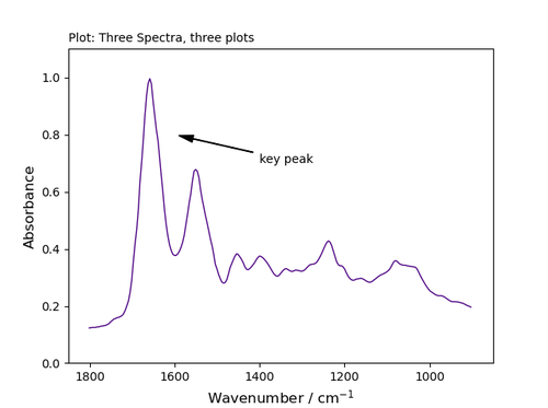
title = ax.set_title('Plot: Three Spectra, three plots',fontsize='10', loc='left') # location = centre, left, right (default is centre)
#add axis labels for left plot
ax.set_xlabel('Wavenumber / cm$^{-1}$', fontsize='12')
ax.set_ylabel('Absorbance', fontsize='12')
#set axis limits -->can use to reverse axis for IR spectra
ax.set(xlim=(1850, 850)) #this is the wavenumber region you want to show
ax.set(ylim=(0,1.1)) #this is the absorbance range
#annotate
ax.annotate('key peak', xy=(1600,0.8), xytext=(1400,0.7), arrowprops=dict(facecolor='black', width=0.4, headwidth=6, shrink=0.05),)
#ax.legend() #if you added label text you need this to make a legend
plt.show()
To add an arrow, format your plot as above and then add the line:
xy indicate the location of the arrow tip - using the plot's co-ordinates;
xytext indicated the location of the text;
choose the properties of the arrow (facecolour; width=line thickness; headwidth = size of head; shrink move the tip and base some percent away from the annotated point and text